Well, not strictly new, since most have been up on my weak auras page for a while now, but the pictures are new.
New Stagger Aura
- Bar instead of icon
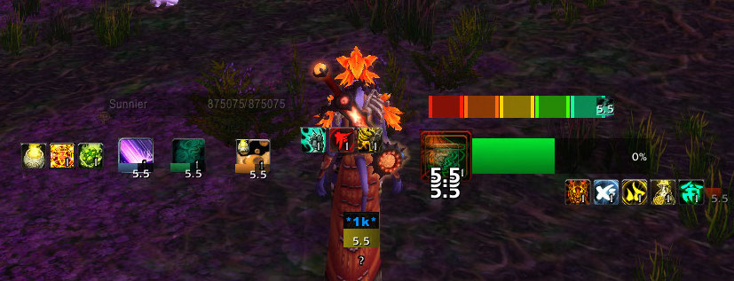
Expert stagger management relies on being able to discern more than just general red/yellow/green colors. A high yellow (5.9% of your health per second) is very different from a low yellow (3% of your health per second). Once you get into heroics, red stagger becomes the norm and has a far greater varience, from a low 6% to anywhere around 20% per second for extreme fights.
Now, you can depend on purely numbers. You can look at a stagger dealing X amount of damage and decide if that’s worthy of purification. But you can make that decision even easier by relying in imagery instead of numbers. That’s where I think a stagger bar, which compares your total (unpurified) stagger damage to your max health, excels. It enables fast decision making without relying on interpretting numbers. If it’s a full bar, that’s obviously dangerous, if it’s a half-full bar, that requires some thought.
Inspired by Gethe88’s Stagger Aura.
Guard Aura
- Shows predicted shield amount when available to use.
- Shows remaining shield amount when active.
This update has been around for a while, but the most recent change is that it shows the predicted shield amount. Helpful for gauging your current vengeance and how much damage you’ll actually reduce.
New Cooldown layouts (Elusive Brew, Guard, Fortifying Brew, Zen Meditation)
- Minor change to timer sizes.
Changed the layout a bit so that the timer bar for an unavailable cooldown is much smaller than the icon for an available cooldown. The goal here is to make it easier to determine which cooldowns are available at a glance. Basically, it’s only big if you should be thinking about it.
Copy Cooldowns Aura
Copy Elusive Brew Aura
Shuffle Aura
- Icon size and transparency changes relative to the remaining duration.
This is another old change, but if you haven’t updated for a while you might not have it. The shuffle icon grows and shrinks depending on how much you should be paying attention to it. For long shuffle durations, it’s a small, transparent icon. For very short durations or missing buff, it will be large and red and fully opaque.
Chi Bar Aura
- Color and icon changes.
As much as I liked my 4 or 5 little suns for chi, this new scheme works better. It goes from red (low chi) to green (high chi), and it looks more professional as well as providing a sense of urgency when at low chi (to encourage pooling).
Some layout changes
My WeakAuras tie into my unitframes tightly. I have my health frame to the left — obviously very important for a tank to pay regularly attention to, and my chi and energy to the right, the keys to our active mitigation. My target unitframe is way at the top of my screen. It’s important to occasionally see how much health your target has, but it’s not something you need to be aware of every second. Please consult my guide on changing the size and shape to your liking.
Go to my regular WA page for the full set, as well as instructions.


